It almost seems redundant to talk about colorful garden art. Gardens are some of the most colorful places around many homes. And in botanical gardens far and wide, there’s seemingly no end to the shapes, colors, and compositions of plants and flowers. And, naturally, this all makes for fabulous artwork.
From Georgia O’Keefe to Claude Monet to Mary Cassatt, you can find colorful garden art in museums worldwide. As beautiful as both gardens and art may be, there’s no reason to restrict this beauty to your backyard or the gallery. In fact, we can bring colors, textures, shapes, lines, and patterns to our dinner plates.
In her story, Eating the Rainbow, Becky Rupp reminds us that a healthy diet includes plenty of color. “Rainbow seems to be the way to go: the truth of the matter is that the more colors on your plate or in your salad bowl, the healthier the meal.”
For gardeners, that doesn’t seem too challenging. We have brilliant red tomatoes, bright orange sweet potatoes and carrots, purple potatoes and eggplant, green peas and peppers, blueberries, yellow corn and squash, and so much more! And these colors often signify the presence of particular nutrients, so the more the merrier.
But what happens when the colors on the plate don’t match the colors in the garden? For example, do you really want to eat green eggs or ham? How about blue tomato sauce? If that doesn’t sound appealing, you’re not alone. Don’t miss Becky’s exploration of the colors of our food!
GreenPrints Has Colorful Garden Art, Stories, and More!
This story comes from our archive that spans over 30 years and includes more than 130 magazine issues of GreenPrints. I love pieces like these that turn stories inspired by nature into prescient life lessons. I hope you do, as well. Enjoy reading!

Eating the Rainbow
Garden colors are good for the plants—and for gardeners.
By Becky Rupp

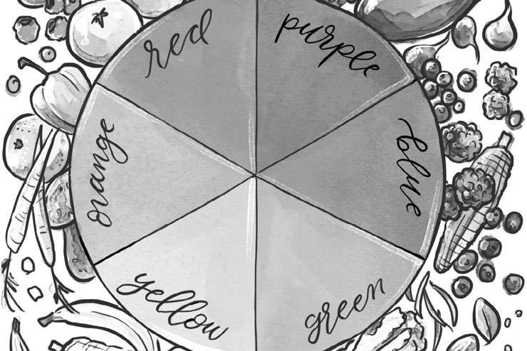
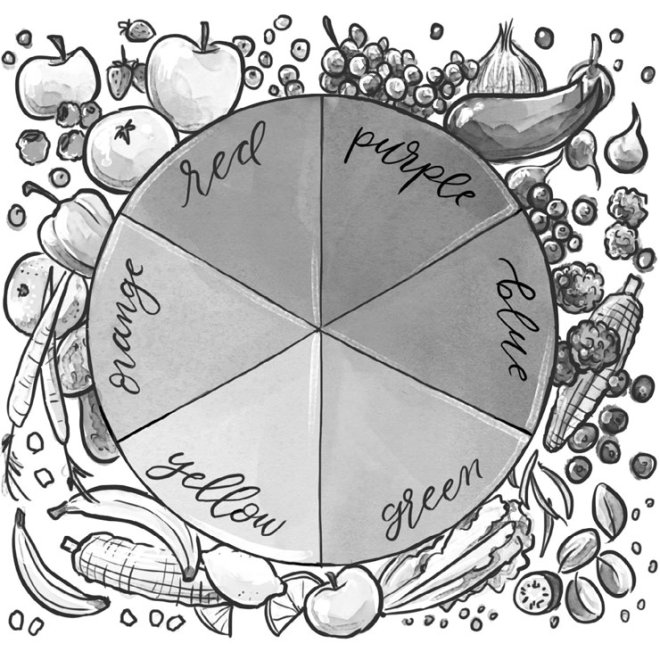
A lot of nutritionists these days are urging us to eat our way through the color wheel. The Seven Day Color Diet, for example, first popularized in 2003, suggests choosing food of a different color for each day of the week. On Red Day, for example, diners eat tomatoes, apples, and cranberries; on Orange Day, squash, carrots, and sweet potatoes. (The seven recommended colors—they cheat a bit —are White, Red, Green, Orange, Purple, Yellow, and Rainbow.)
NPR’s The Splendid Table reported on a ROY G BIV diet in which each day of the week was devoted to a different color of the visible spectrum: Red, Orange, Yellow, Green, Blue, Indigo, and Violet. The participants started out boldly with Red (tomato soup, red peppers, pomegranates), but fell down a bit at the BIV end of the scale, which was heavy in blueberries and blue corn chips. They finally polished off the week with a multicolored veggie pizza.
Rainbow seems to be the way to go: the truth of the matter is that the more colors on your plate or in your salad bowl, the healthier the meal. Visually, this is also a plus for us: we’re a color-oriented species. Stick us in a colorless environment—say, one of those offices with beige cement-block walls—and we soon become depressed and unproductive. We mope and doodle on our spreadsheets. There’s a reason why, in the dismal and dystopic world of George Orwell’s 1984, there’s no color in anything.
In 1999, a concept of restaurants serving food in the dark began. By this they didn’t mean a romantic candlelit dimness, but pitch-black, the deep dark of caves and coal mines where you can’t see your hand in front of your face. The idea is said to have originated with Jorge Spielmann, a blind clergyman from Zurich, who periodically asked his dinner guests to wear blindfolds to help them better appreciate his sightless world. When some remarked that the blindfolds enhanced their senses of taste and smell, Spielmann decided to open a restaurant. Hence Zurich’s Blindkuh (Blind Cow), the first restaurant in the world to be entirely staffed by blind waiters and waitresses and where dining takes place in the dark.
Since then, dark restaurants have popped up in cities world wide. There’s one just north of us—Onoir in Montreal—where patrons are allowed a lighted peek at the menu before being led into the dark-as-the-inside-of-a-pocket dining room. In most such restaurants, food is served in bite-sized pieces—owners worry about temporarily blinded patrons waving steak knives around—and is accompanied by wine in unbreakable glasses. The big questions, though: in the dark, does food taste better? What’s eating like, deprived of color?
In theory, the loss of one sense—say, sight—leads to neural re-scrambling in the brain, apportioning more neurons to still active senses like hearing, smell, and taste. At a guess, this should make meals a more enriching experience for the blind—but for the temporarily blindfolded it doesn’t seem to work that way. Visual cues are a major part of taste perception. Patrons at dark restaurants describe an interesting, if somewhat freaky, experience; and many found themselves unable to identify flavors. (Is it chocolate or vanilla? Lettuce or cabbage? Pudding or mashed potatoes?)
While eye-catching color can make for better eating experiences, color can also backfire. Some colors—no matter how gorgeous or unobtrusive in other venues—are just plain off-putting in food. The gray glop doled out to orphans in Oliver Twist may taste ambrosial for all we know, but most of us just can’t get around the fact that it looks like wallpaper paste.
The H.J. Heinz Company, hoping to appeal to kids in 2000-2006, produced a line of ketchups variously colored in green, purple, pink, orange, and blue. Nobody liked them—not even 5-year-olds wanted purple sauce on their French fries—and the company soon dropped the idea and returned to traditional tomato red. We all cheer when the beleaguered narrator of Dr. Seuss’s Green Eggs and Ham finally takes a bite—but, psychologically speaking, we don’t like our eggs (or ham) colored green. Photographer Lawrie Brown’s Colored Food series—a visual exhibit designed to highlight the psychological aspects of color in food—features pictures of luridly purple chocolate sauce, pea-green corn on the cob, and bright-blue roast chicken. It’s pretty, but the thought of eating any of it is awful.
Blue, worldwide, seems to be the planet population’s favorite color—provided it’s not in food. Blue, researchers hypothesize, is commonly associated with spoilage and poison. Nobody wants to eat a blue meatloaf; and studies show that dieters, struggling to cut back on calories, might better do so by tinting their dinners blue.

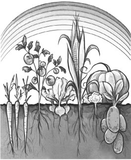
Color in the garden, on the other hand, is scrumptious. A Summer garden is a riot of color: tomatoes and beets are red; eggplants, purple; carrots, orange; squash and corn, yellow; peppers, broccoli, spinach, and zucchini, several shades of green. And then there are not-quite-so-traditional colors: we’ve also, in our time, grown blue potatoes, purple peppers, yellow-striped tomatoes, white pumpkins. From all, though, that burst of color signals that the stuff we’ve been watering, weeding, fertilizing, and fussing over for the past many weeks is finally—finally—ready to pick and eat.
Color in the garden is not only inherently appealing—I mean, who can look at a ripe tomato without wanting to bite it?—but it’s also good for us. The pigments that give vegetables and fruits all those lip-licking hues are known as phytonutrients; and plants, collectively, make some 25,000 different kinds of these. Plants don’t manufacture them with us in mind; they produce them to protect themselves from munching bugs, invasive bacteria and fungi, and sunburn. It’s just a lucky sideline for us that a diet full of them appears to beef up our immune systems, reduce our risks of cardiovascular disease, Type 2 diabetes, and cancer, and possibly even protect us from the sort of cognitive decline that leads us to forget where we last left our glasses.
Color isn’t just a feast for the eyes.
But what a gift to us that it also is. ❖
By Becky Rupp, published originally in 2022, in GreenPrints Issue #130. Illustrated by Chelsea Peters

What is your favorite color for dinner? I’d love to find out in the comments!


